Mueez Khan
Mueez Khan
Brief Overview of the Boerne Water Data Dashboard
Skim a brief overview of the water data dashboard I developed for the city of Boerne, Texas while working at datHere. Interactive map, charts, and more.
Published: 2025-02-25
Last updated: 2026-07-13
work
rust
next.js
react
polars
plotly
data engineering
data visualization
This post is based on a blog post I wrote for datHere's blog.
Background
While working at datHere, one of my projects involved re-developing a dashboard about water data for the city of Boerne, Texas. There was an existing dashboard from a few years ago but I found various visualizations in the data that were not fixed, the dashboard was not primarily designed for mobile device usage, and other issues led to suggesting the opportunity for developing a new water data dashboard. The new dashboard is now available at boernetx.thewaterdata.com.Data pipeline overview
There is a Rust project that runs on a nightly basis to compute the updated data used in the dashboard by extracting and transforming the relevant data from the water utility and other APIs such as the USGS water services and U.S. Drought Monitor. Then the data is transformed into the necessary formats (usually JSON files) primarily with the Polars library and finally the computed files are uploaded for usage in the water data dashboard and water data hub. Note that I didn't set up the external water data hub. The frontend is built with Next.js and deployed with Cloudflare Pages. Interactive charts use a React library of Plotly and the interactive map uses a React library for Leaflet. The UI primarily uses shadcn/ui components. Let's go over a few key features in this new dashboard that may be useful for users.At-a-glance Key Performance Indicators
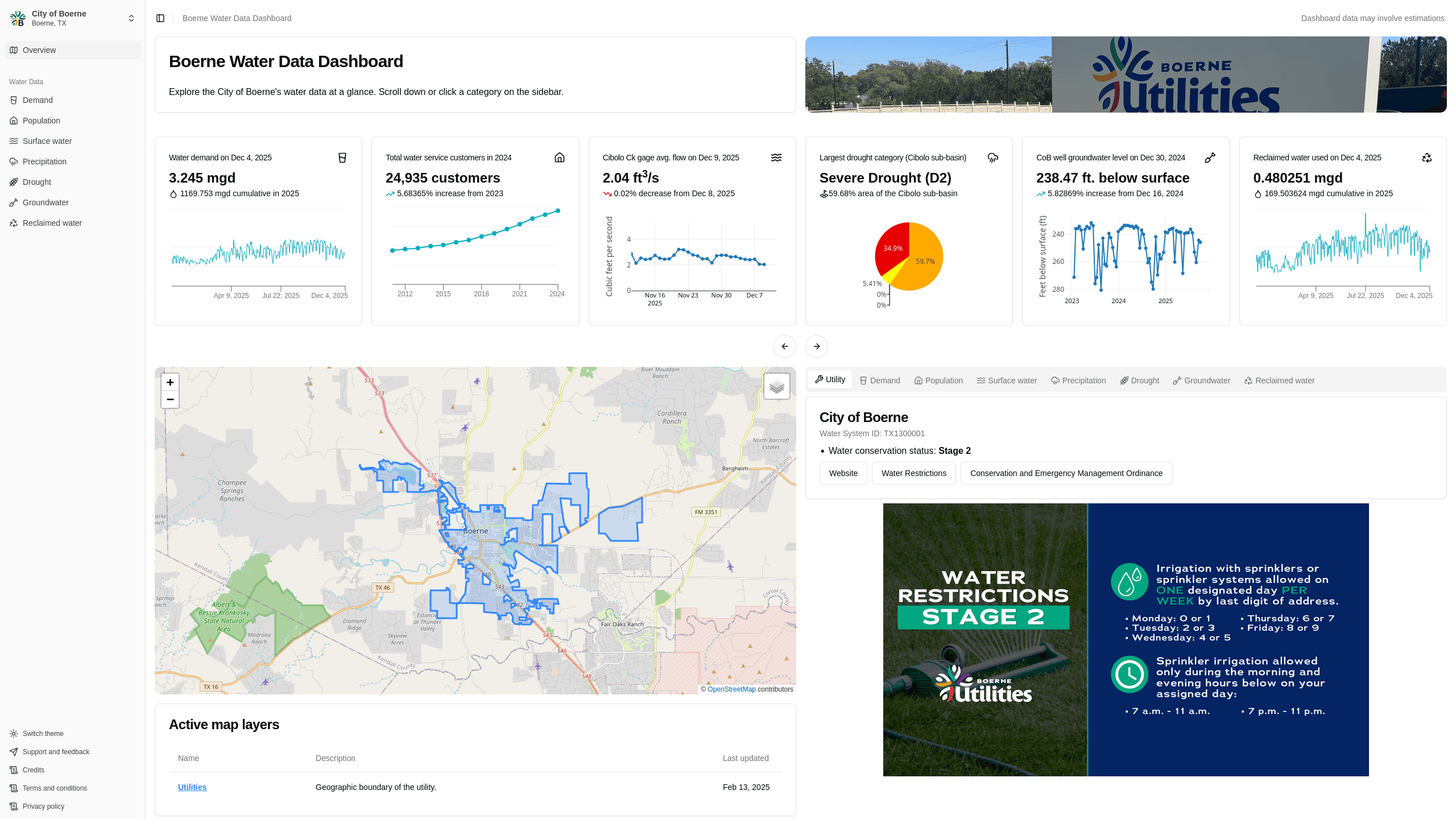
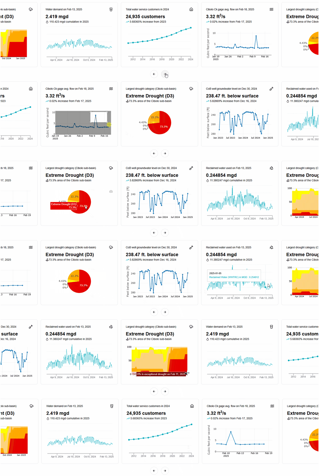 Scalable based on preferred water data insights, the dashboard features various "Key Performance Indicators (KPIs)" (name provided by a team member). These are cards of highlighted information along with relevant calculations if possible and interactive visualizations in a carousel as the first major useful content once a user accesses the dashboard.
One of the benefits of using a carousel for these KPIs is that a carousel allows for scaling the number of cards as necessary along with customizing the data for however many water data categories are necessary. The benefits of the KPIs themselves are more important however, where users can load the webpage and almost immediately see insights and interact with the latest data since I also set up automations for the data and calculations. The quick insights being available and also explorable due to the interactive nature of the visualizations is intended for helping answer important questions swiftly.
Scalable based on preferred water data insights, the dashboard features various "Key Performance Indicators (KPIs)" (name provided by a team member). These are cards of highlighted information along with relevant calculations if possible and interactive visualizations in a carousel as the first major useful content once a user accesses the dashboard.
One of the benefits of using a carousel for these KPIs is that a carousel allows for scaling the number of cards as necessary along with customizing the data for however many water data categories are necessary. The benefits of the KPIs themselves are more important however, where users can load the webpage and almost immediately see insights and interact with the latest data since I also set up automations for the data and calculations. The quick insights being available and also explorable due to the interactive nature of the visualizations is intended for helping answer important questions swiftly.
Interactive multi-layer map
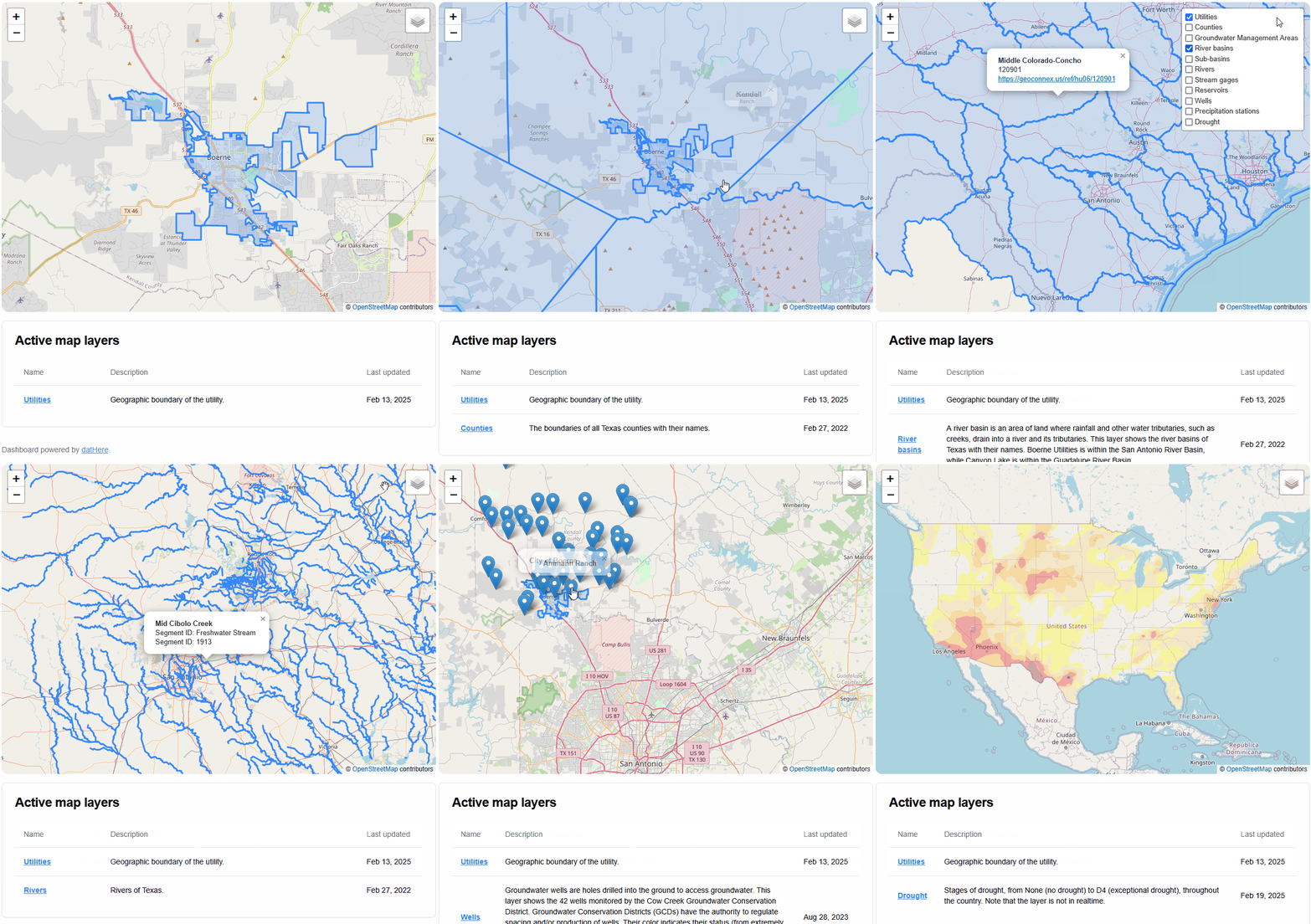 By design, water has its own infrastructure. To help understand this interconnected nature of water, the dashboard features an interactive map with layers of demonstrating geospatial data including rivers, watershed boundaries, wells, and drought. Having a holistic view of the utility and its surroundings can help users understand how water data is connected within the city and its surroundings.
The layers are primarily from the previous dashboard's files however a new utility layer was provided and the drought map is automated for updates (usually on a weekly basis). Therefore the map layers are shown in a table format with one of the columns being "Last updated" to clarify when the map layer was last updated so users can identify if the layer is outdated for their analysis purposes.
Also the map layers are available for download on Boerne's water data hub which datHere also hosts and are linked to in the active map layers table.
By design, water has its own infrastructure. To help understand this interconnected nature of water, the dashboard features an interactive map with layers of demonstrating geospatial data including rivers, watershed boundaries, wells, and drought. Having a holistic view of the utility and its surroundings can help users understand how water data is connected within the city and its surroundings.
The layers are primarily from the previous dashboard's files however a new utility layer was provided and the drought map is automated for updates (usually on a weekly basis). Therefore the map layers are shown in a table format with one of the columns being "Last updated" to clarify when the map layer was last updated so users can identify if the layer is outdated for their analysis purposes.
Also the map layers are available for download on Boerne's water data hub which datHere also hosts and are linked to in the active map layers table.
Interactive charts and visualizations
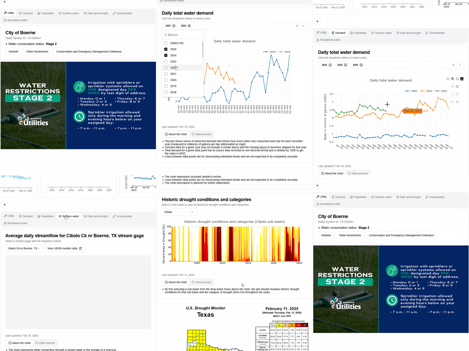 The dashboard features interactive charts and graphs with tools including zooming and panning, descriptions about each visualization, and data source information (relevant KPIs are usually based on these data sources). Infographics are also available such as the current water restriction stage and a Texas state drought map which could be useful for sharing on social media.
Want to learn more?
Continue reading about how the data engineering for the dashboard is built with Rust, Python, and Polars in my more recent blog post.Share your thoughts
Submit a comment about this post that may be shared.
Join the Newsletter
Receive updates during my career.
Featured Publications
Technical writing on work experiences, projects, and tools you may find useful.
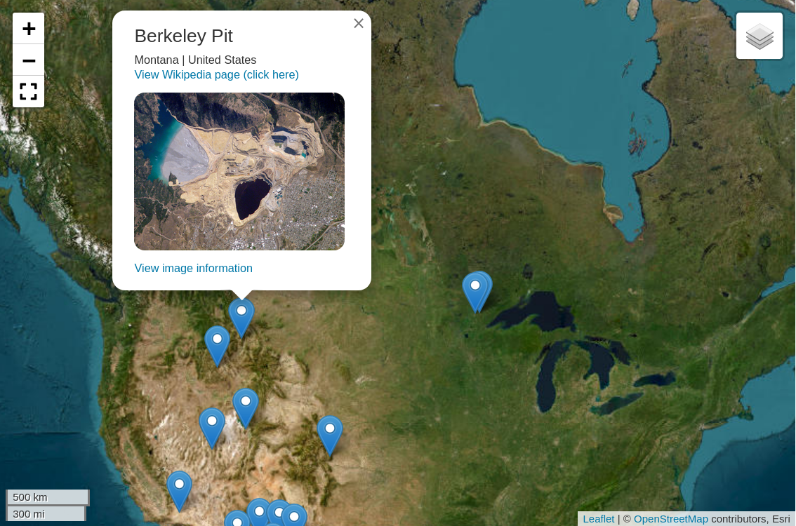
Mapping open-pit mines in the US
Python
Polars
Folium
Leaflet
Marimo
New "Typing with Typst" course
Typst
Generating Plotly charts for water data
Python
Polars
Plotly
Data visualization
Gazetteers for Texas Water Data Hub
JavaScript
HTML/CSS
Python
Leaflet
Boerne Water Data Dashboard
Next.js
Rust
Data visualization
Data engineering
Polars
Plotly
commit-helper

Rust
Building a CKAN Release Timeline
Python
CKAN
TimelineJS v3
HTML
View more written content on my blog.